After an initial burst of creativity last week, it felt like I came to a screeching halt this week as I opened up Sketch and tried to put some flesh on my ideas.
Finding inspiration in other designers work while fighting the urge to fall into analysis paralysis, I managed to wade through the sludge of my own mind and make some minor progress.
Getting in a tangle
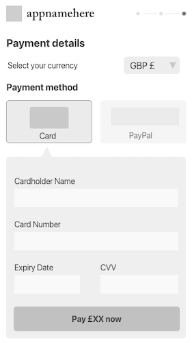
As I started to lay out my wireframes in Sketch, I realised it’s been a while since I designed for multiple screen sizes.
Sketch has a great set of tools for making designs responsive, but after setting up various pages and artboards I gradually felt more and more overwhelmed by the sheer amount of design work that lay before me.
After spending what seemed like a lot of time trying different ways of working with pages and artboards, it dawned on me that I was massively over-complicating the process!
Mobile first
Since responsive design became a thing ten years ago, I’ve worked with several teams that professed to designing and building their product “mobile first”.
What that often actually meant was that they had a complete desktop design, and had crammed most of the functionality into a mobile viewpoint, removing any functions that wouldn’t fit.
As I looked at my ideas for the wireframes, I realised I’d been guilty of the same - the sketches in my notebook were mostly for desktop layouts!
Focusing on large scale desktop web apps for finance & big data over the past year has obviously affected me more than I thought…
Once I acknowledged that the target customers of this app are likely to be using their mobiles - whether that be a native app, or mobile web - it made sense that should I properly design mobile first, and tablet & desktop later.
Good designers copy, great designers steal
Falling into a Twitter hole at some point this week I came across a recent tweet by someone I consider a bit of a legend, Cameron Moll, who is relaunching his blog after nearly 10 years away.
It’s exciting that someone whose site I used to read semi-religiously and who gave so much to the web design community is about to start blogging again. I'm looking forward to hear & laern from what he has to say after so many years.
Seeing his design reminded me of an article of his that he wrote eons ago (2003 is eons in internet years) that I read while I was studying at university: “Good Designers Copy, Great Designers Steal”.
In that article Cameron outlines his views on how to copy other designers work as a starting point, then build your style and detail on top. At the time I first read it as a fledgling designer it was groundbreaking stuff. This week it's lovely to be reminded that although 17 years have passed since he wrote it, everything is still on point and valid.
It was exactly the refresh I needed, and gave me the permission I needed to stop trying to reinvent the wheel. After getting back into a a bit of a flow I was able to get the core part of the app design for mobile well underway.
Finding your wins
Although this week felt slow and I spent far too much time going round in circles, I’ve learned in recent years that looking for the subtle wins when things feel annoying or slow can keep things moving forward.
Seeing the design for Cameron’s soon-to-be rebooted blog (and being inspired to improve the design of this site), I realised that the win this week was to get back to basics and focus on the core of what I’m building.
This coming week I’m going to take that win and run with it - my aim is to get the wireframes complete, and be ready to flesh out with colour and other design touches soon.