I’m excited to sit down and sketch out the initial customer journeys and wireframes for this project, as I am with every project I work on.
It’s time to get my thoughts down on paper and find out what ideas instinctively feel good, and what else I need to consider, and what needs to be ditched!
Personification
Knowing who I’m designing for, and keeping them as my focus, is key at every step of design and development process.
If I was working with a team it’d be at this point that I’d suggest we consider using a UX tool called Personas. These are fictional representations of clusters of target customers that exhibit common behaviours or attributes.
A Persona is a single fictional person that is created from clear patterns of behaviours in customer research.
Their behaviours & expectations can be drawn up into a useful profile that should be shared amongst the team that is designing and building the product.
This helps focus on the target customers, and increases the chance of making decisions quickly.
It’s important to note that Personas are not a replacement for actual conversations with customers, and should be updated as you discover more about your audience and customer base over time.
If you want to find out more about Personas, and communicating the design process with a larger team, or client, then I thoroughly recommend Dan Brown’s book Communicating Design.
Because I’m working on my own on this project, I'm going to skip Persona creation for now, as I have a clear vision in my head of my target customers; I wanted to mention them here for people who might not have come across them before.
There’s a story to every journey
Taking the list of basic functionality I worked out last week, and the clear vision of who my target customers are, I started with a basic sketch of the key steps of each of the primary customers journey through the application.
Thinking of a customer journey through my application as one of a set of stories rather than a group of pages or screens, really helps with turning initial ideas in to functional concepts.
For example: my customer is setting up a gallery to enable their guests to share photos of their event. The story of them setting up the gallery, like every good story, has a beginning, a middle, and an end.
Knowing that my primary customer is busy, has a lot of decisions to make, and is looking for something super simple and quick to do, helps build a narrative that:
- keeps the number of clicks to a minimum,
- includes a certain amount of handholding, and
- communicates default settings,
to make it clear to the customer that they’re in safe hands.
Sometimes I’ll write these stories down before I sketch any further, and at other times, they’ll be mental notes I’ve made, so that when I’m reviewing my output I can compare it with my original thinking.
Once I had a handle on the core stories for each of my primary customers (remember, I have event organisers and their guests to think about), then I started designing the first set of wireframes.
Sketching wireframes, part one: Low Res
A wireframe, if you’ve not come across one before, is a visual outline of a page or screen in an app or website. They can be anywhere on a range of low resolution sketches through to detailed designs that are only missing colour and images to make them complete.
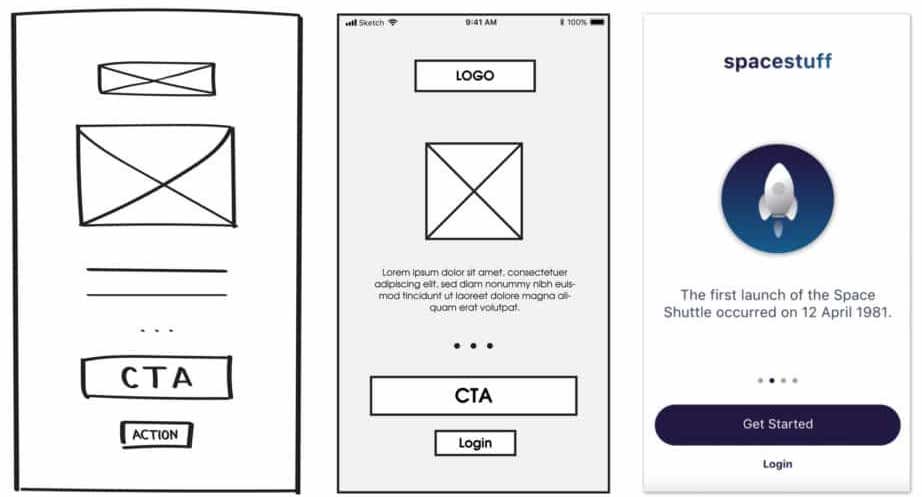
In a similar style to Nathan Barry (albeit with much harder to read handwriting), I like to sketch out very low resolution wireframes that take each part of the customers story, also listing out any questions that pop up as I’m going - that I can answer later, while planning the implementation of the designs.
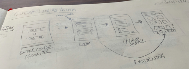
This week I was able to sketch out all the major steps of the customer journeys, so I’m now focussing on bringing these thumbnails into Sketch (the app I use to design), and laying out the detailed wireframes.