Recently I had the good fortune to work with a really experienced UX professional here in Jersey (who I’d actually once worked with in north Wales at MoneySupermarket 15 years ago!).
As part of the project we worked on together, she sent over a Figma doc to help me and the founders of the company I’m working for work out what content we want on the dashboard of the app we’re building.
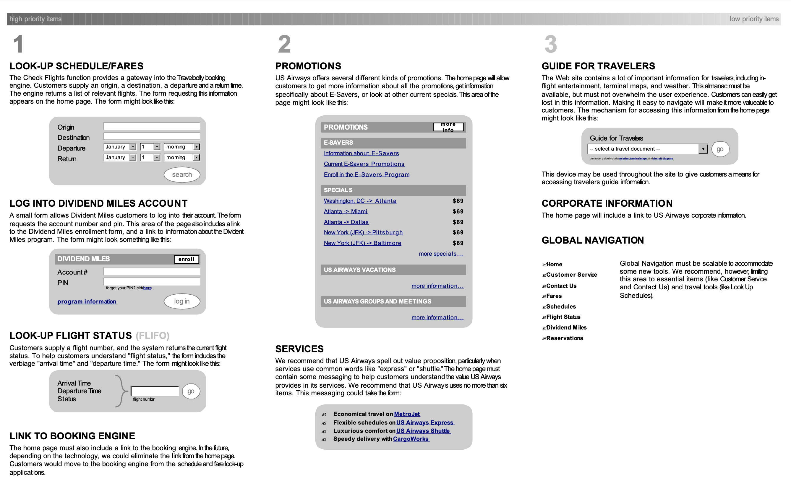
I immediately recognised the example in it as a Page Description Diagram, or PDD.
I first came across this tool for prioritising page content when I read Communicating Design by Dan Brown (no, not the author of the Davinci Code) back in 2006 when I was Head of User Experience at SnowValley, a leading e-commerce agency. I remember it being book full of great ideas and techniques I used a lot back then that I hadn’t realised had stood the test of time so well.
I found it very helpful when guiding clients and teams through the fun part between inception and designing web applications & sites. I fondly remember going through the exercise creating PDDs when my team redesigned Halfords e-commerce site in 2006, and seeing the eventual site design really reflect our thinking and delivering a much better experience for our users.
If you’ve never come across one before, they’re a page split into 3 columns, marked High, Medium, and Low. In each column you describe components or sections of the page according to the priority of the component according to your primary persona & their journey through your site or app.
Although they’re originally designed to be a deliverable that can be passed between teams and to clients to help focus discussions and show design thinking, I found them valuable as a process especially if I was then taking the PDD and laying out wireframes based on their content.
I thought I’d share a few tips to get the most out of them:
- Don’t jump straight to thinking about look & feel. Start with writing a one line description of each component you think would help the primary user on their journey, then do an initial pass at prioritising them into the columns.
- Once you’ve got them sorted across the columns, then it’s a good idea to sort them within the columns so the one you consider most important ends up in the top left of the page, and the least important/used one ends up at the bottom right.
- Having sorted the priority now dig in and flesh out what content you think is relevant for that component. Think in terms of the users actions, how often they might need to read or perform the action, and whether there are different states the component might cycle through.
- By this point you’ll likely be itching to sketch some kind of wireframe or design for each component - try to keep it fairly low fidelity if you can, it’ll help the next step.
- Now using your favourite design app, lay out the components on the canvas according to their priority. Highest priority item? Probably is a decent size and takes up the prime real estate on the page. Lowest priority item? Likely to be in a sidebar or section footer.
Sometimes the deliverables we used to create for clients seemed like a waste of effort as they took a while to put together but seemed under-used by the team. However, PDDs genuinely helped me focus design decisions on what the users need the most and often helped me break the back of complex designs.