Since the awesome kick in my rear last week, I’ve been really focussed on making progress with the designs of the app challenge.
I’ve moved on from simple wireframes, fleshing out the colour & detail on each of the pages.
A change of plan for the initial testing
As I started to build out the wireframe prototype, I realised that for a lot of the UI I’m following well known design patterns.
After a bit of deliberation I switched over to put some flesh on the bones of the wireframe, looking into colour palettes as well as adding photos and icons.
Translating tools from other areas
I’ve been learning the guitar, on and off, for about 30 years. I don’t think I’m particularly good yet, and have only played a few open mic nights since my teens, but I still love to play and try and improve.
Recently I’ve been working (online) with a great instructor, Steve Mastroianni, who focusses on making it fun to learn new songs. He’s been helping me to simplify and slightly altering tunes to be able to play along with the record, as well as getting me playing every day.
After just over a month I’ve already learned an Eagles song I’ve always wanted to play, and am half way through learning a classic Stevie Ray Vaughan song too.
As part of this learning, Steve has encouraged me to fill out a daily practice log the covers what I want to focus on for a session, then has spaces for what I thought worked, or needed more attention, and what I want to work on for the next session.
So, this past week I’ve started doing the same thing for my app challenge work.
Keeping it simple
I now have a Google Docs file filling up nicely with daily entries.
Each day has the following headings:
- Date
- Working on
- What went well
- What didn’t go well
- Extra Notes
- Next Time
I don’t always fill out the extra notes section, but I’m finding it’s already helping with my focus for each session when I work on the project.
What am I working on?
As part of my follow accountability call with my friend last week, I admitted to a fear of sharing what I’m working on.
It felt quite embarrassing to admit to that particular fear, as I always advise anyone working on an idea that ideas aren’t worth much - it’s the execution that counts. This comes from a number of places, but the core inspiration was from Paul Graham’s essay on Ideas.
BorrowMyDoggy was a great idea, but if my cofounder hadn’t tracked down someone to help her design & build it (that’s me!), it wouldn’t have become the dog sharing platform it has become today.
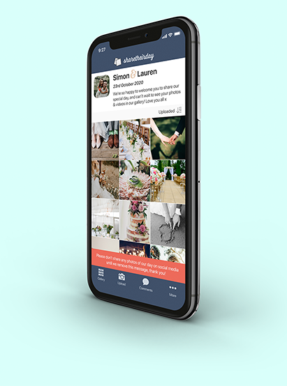
So, without too much fanfare, I'm working on an app that helps wedding guests share their photo & video memories with the wedding couple in a secure, private gallery.
It’s called Sharetheirday.
And it’s starting to look a little like this:

The iPhone I’ve popped the screenshot in is by Adam Skovran.
Depending on when you look at this, you'll notice the logo on the website is very different to the app. I’m trying to decide whether to design the logo myself, or pay a logo designer to help bring up the quality level.
What’s next?
I’m nearly done with all the screens & interactions in the prototype, so over the coming days, I’m going to produce a few different prototypes for different phone screen sizes, and get it in the hands of some real life humans!
